News
Check Out the New Thunder Lotus Brand Identity!
Hi everyone!You may have already noticed a few changes to our website today: we have a fresh new brand identity for Thunder Lotus that’s ready for its close up! I’ll tell you all about it in a minute, but there’s really something you should check out first (sound ON, pls!): Pretty…
Hi everyone!
You may have already noticed a few changes to our website today: we have a fresh new brand identity for Thunder Lotus that’s ready for its close up! I’ll tell you all about it in a minute, but there’s really something you should check out first (sound ON, pls!):
Pretty sweet, no? The animated logo came together as a true team effort, pooling the talents of our art and animation teams, in collaboration with our extended family (our perennial composer Max LL, the good people at Pixel Audio, and the design agency byHaus). We hope y’all love it as much as we do, because it’s really meant to be the most effective representation of who Thunder Lotus is as a studio/family in 2023. But I’m getting ahead of myself here – let me start at the beginning.
In the beginning…

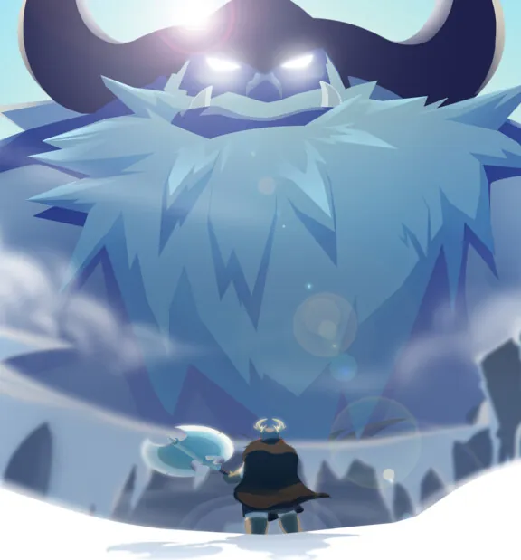
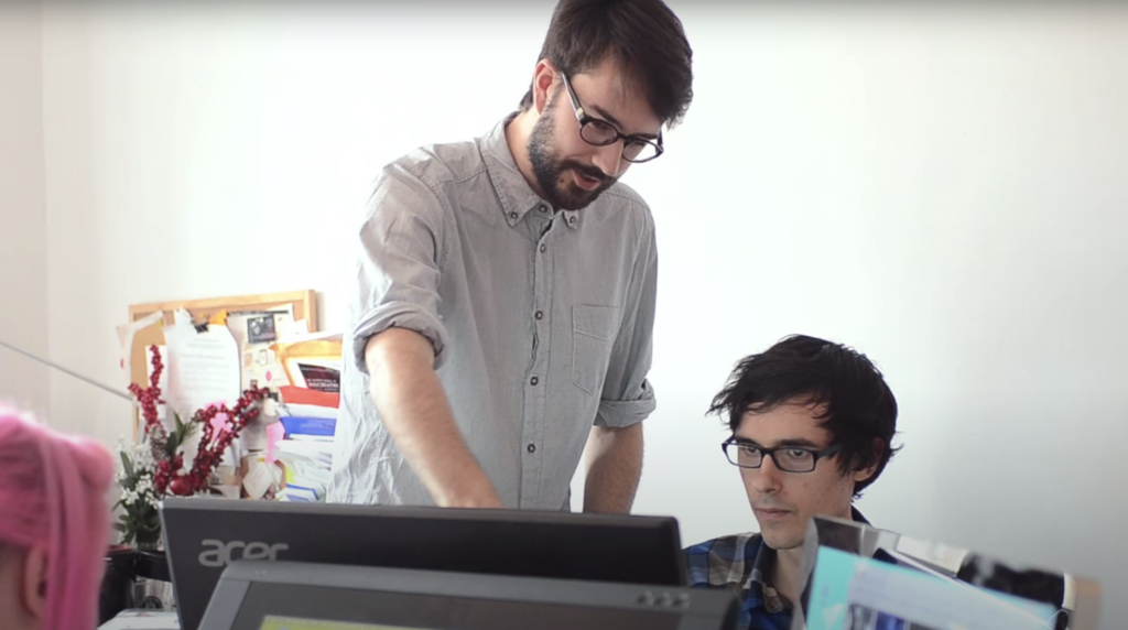
Thunder Lotus was founded over nine years ago in 2014 – just a handful of people rallied around our founder Will, trying to make our first Kickstarter happen. For that first while, we were more commonly known as the Jotun Team; our website was a tumblr redirecting from jotungame.com; in short, Jotun defined who we were – and would continue to do so for a few years.
Sometime before we released Jotun to the masses, we settled on our company name: Thunder Lotus Games, with its origin story somewhat reflected in the animation you just watched. As Will tells it:
“So I came across some Lotus flowers floating on the water while paddling across a lake. Lotus flowers grow out of the murky muck at the bottom of the water, eventually rising to the surface in these gorgeous blooms – and I felt this was a fitting metaphor for game dev: creating something beautiful out of such humble, messy beginnings. So I thought that Lotus Games would be a great name for a studio…. but another company had already made that “brilliant” idea a reality, so we needed a better idea…
And honestly, the more we thought about it, just the lotus metaphor alone doesn’t quite cut it: the flower is spectacularly gorgeous, but also small, unassuming, and delicate. What we were creating with Jotun – what we still create – needs a spark. It needs an edge. It needs to be massive and epic. All that doesn’t come from outside, it’s not an Act of God. It comes from the team: they’re the lightning bolt that makes our games great.”
Second verse

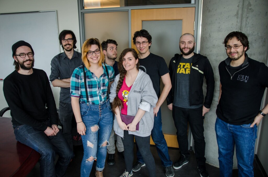
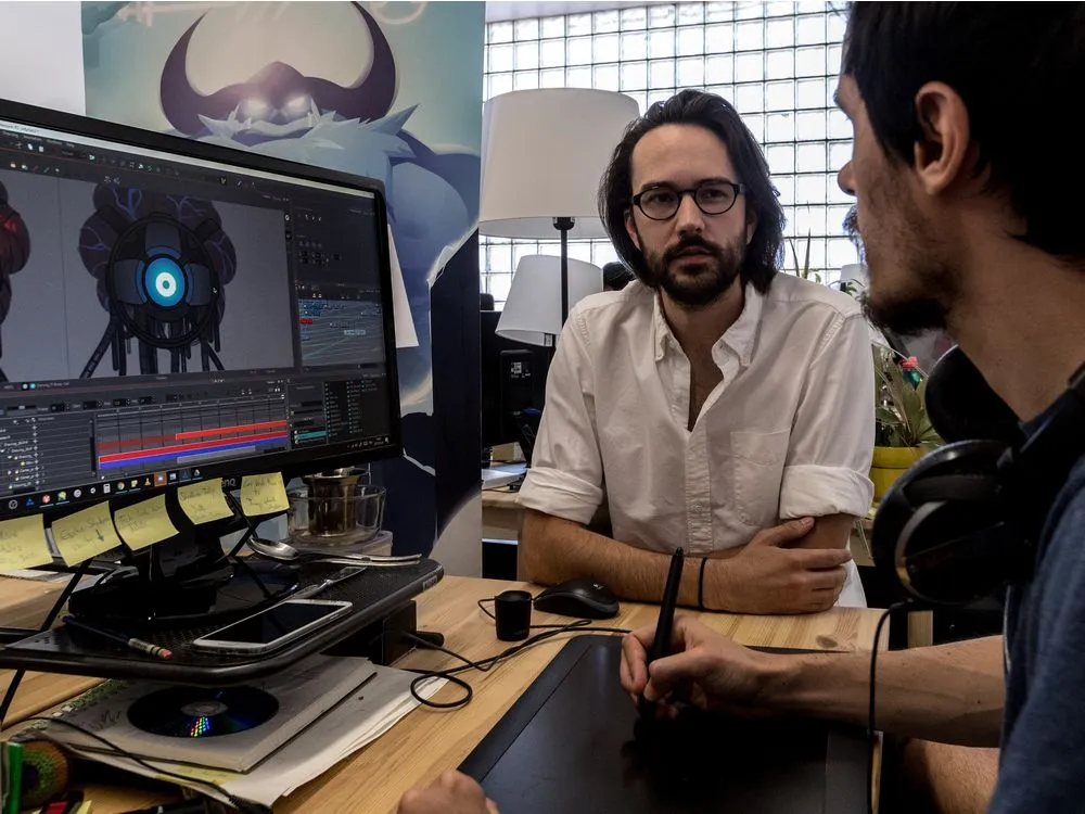
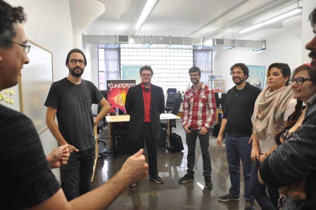
Three years later, the initial core Jotun team had solidified and grown to seven full-timers, but our extended family was already considerably larger. We were an experienced team, ready to release our second game, Sundered. But by and large, we hadn’t given much more thought to what it meant to be part of the Thunder Lotus family, beyond being nice, talented folks striving to make games we could be proud of.
At the same time, we refreshed our website a tad, and tweaked our logo – did you notice the difference? Our website designer proposed dropping the hexagon, making the lines bolder, adding a little color to the site… and we said: “Sure! Looks good!” And to be fair, it did!
But in retrospect, we didn’t take any time to think about how or why these changes made our logo and website more “us” than the OG version…
We are Thunder Lotus
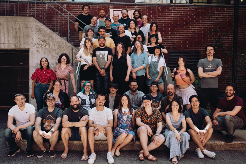
That last bit is a crucial one. Thunder Lotus is now nine years-young. We’ve grown up from the tiny, tight-knit Jotun Team; to the veteran studio that helped you learn how to say goodbye with Spiritfarer; to a tremendously talented and diverse family of 44, currently working on two awesome games.
Along the way, we started really having really deep conversations about who we were as a team, and why we do what we do. It took a while to come up with words that felt right for everyone, but we eventually nailed it. I’ll spare y’all the long version, but here’s the two powerful bits:
Q: What do we do?
We are a video game developer that creates hand-drawn games for indie game fans worldwide. We provide intense and emotional experiences through ambitious, immersive, sincere, and visually unique games.
Q: Why do we exist?
Fueled by our shared passion for video games, we want to build ambitious, innovative experiences that tell deeply human stories. Our creations should reflect both the individual and the collective, engage each player emotionally.
So, you know: yes, we made Jotun, Sundered, Spiritfarer, and… well, you’ll know what comes next soon enough. 😉 But we understand that at its solid core Thunder Lotus is about people – those who make the games, and those who play them.
New Looks

Presentation is important, y’all! It was one thing to agree on what we did, and why we did it – but a whole other kettle of fish to decide how Thunder Lotus should look!
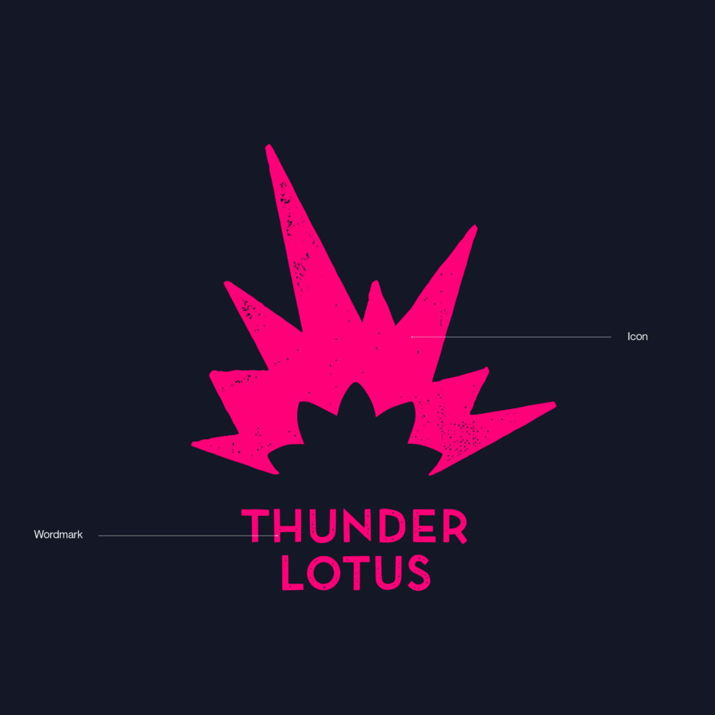
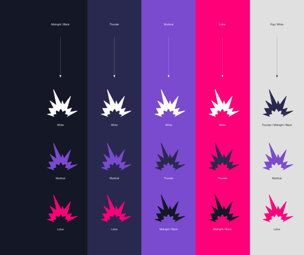
It was decided that, as much as we loved the dramatic, jagged, and monochrome look of Thunder Lotus [ca. 2014], it didn’t really communicate the human side of things. So we worked closely with the good people at byHaus to refresh our brand identity, to address some key aspects of our legacy branding.
- ● It needed more texture – that hand-drawn human touch so key to all our games.
- ● It needed more contrast – that mix of grit and beauty, energy and stillness, and the hybrid elements we love to design into our games.
- ● It needed more color – seriously. Sure, white is technically *all* the colors at once, but it sure doesn’t feel like it.
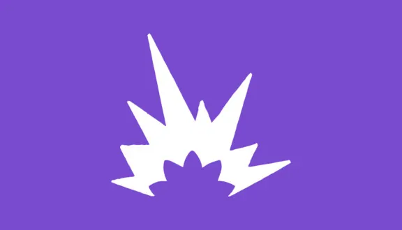
Suffice it to say that byHaus did an incredible job in addressing these points, and rethinking how we could help communicate who we are visually. There’s a lot to love in the result, though the most effective bits IMHO are the subtle hand-drawn texture in the wordmark, the imperfect edges of the explosion part of the icon, and the contrast with the softer, rounder lines of the negative space which recall the lotus shape. It’s much more *us*, and we’re super happy!
We hope you like what you see!
What comes next?
We wanted to quickly roll out the new brand onto our website this summer – the timing was right for a change! But we’re in the process of completely redesigning our website to better showcase who we are and what we do – expect to see a whole lot more of the new brand in the coming weeks and months. Stay tuned!
Thanks for being here!
– Rodrigue and the Thunder Lotus Team
Share

